Visual Identity Standards
When telling the Clarke University story, our images, fonts, and other visual choices add nuance, character, and emotional impact to what we have to say. From traditional and formal to fun and spirited, there are many sides to Clarke, and the items covered in our visual identity package provide guidance on how to tell the Clarke story in an appealing and consistent way.
The items available here are primary official marks and may not be altered or modified in any way, including any elements or colors that make them up. Should you have unique design requirements or questions on anything in the visual identity package, please contact the marketing and communications office for assistance.
OFFICIAL UNIVERSITY MARKS
The Clarke University Logo
The most common visual representation of Clarke, the university logo serves as the mark with the broadest use. It represents the institution as a whole and was designed to communicate the values and characteristics that are at the core of the institution. It is the mark used on all external and internal business and promotional documents.
The Academic Shield
A representation of Clarke’s academic tradition, the academic shield is the formal academic seal of the university. As such, it is to be used for formal items or official materials only, or at the request of the president or provost. Offices or areas requesting use of the academic shield must receive approval from the marketing and communication office.
The Pride Identity
The Pride identity is the most informal of the university’s marks. It is designed to represent Pride athletics and, in a broader way, spirit on campus.
OFFICIAL UNIVERSITY COLORS
Official University Colors
 |  | |||
| NAVY - PMS 289 | GOLD - PMS 116 | |||
| FOR PRINT C: 100 M: 64 Y: 0 K: 60 FOR WEB/ON SCREEN MEDIA R: 0 G: 0 B: 51 Canva/Web #: 000033 | FOR PRINT C: 0 M: 16 Y: 100 K: 0 FOR WEB/ON SCREEN MEDIA R: 255 G: 204 B: 0 Canva/Web #FFCC00 |
OFFICIAL UNIVERSITY FONTS
Typography is another important component to brand identity, as it helps convey the personality of our institution in a consistent and subtle way. To reinforce our visual identity, we consistently use a main typeface.
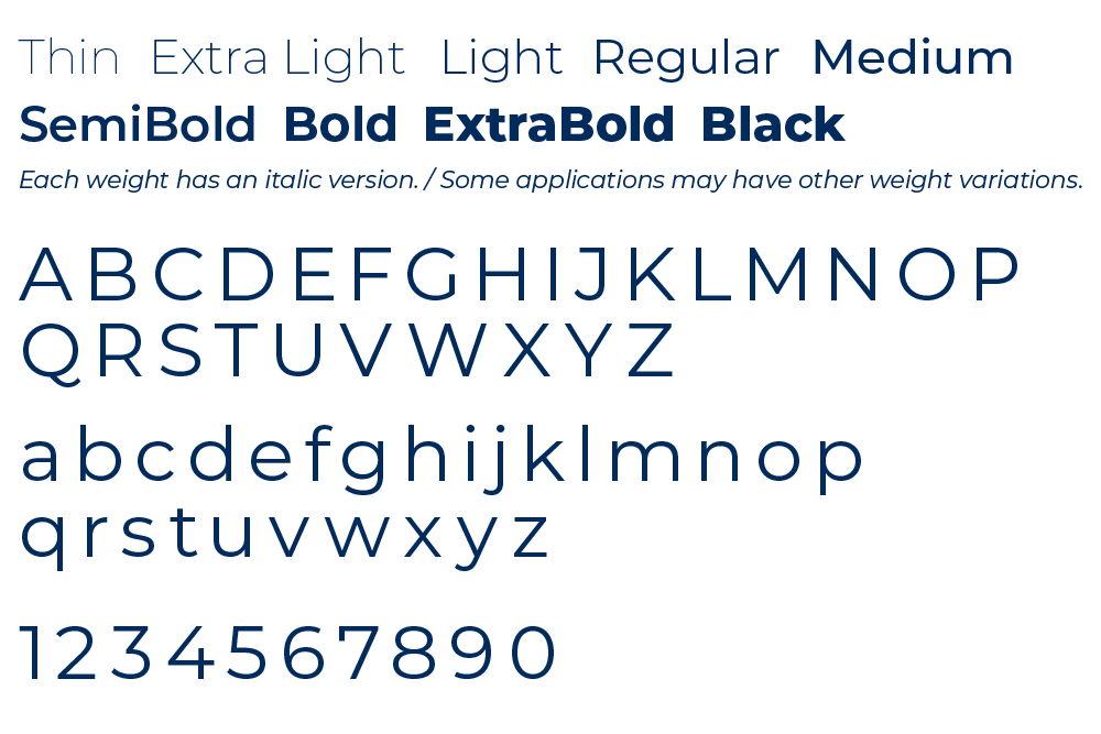
Montserrat Font Family
Our primary font is Montserrat. Originally inspired by the urban typography of streets signs and businesses, Montserrat is a sans-serif font with a collection of varying weights that allow it to be subtle at times and strong when needed. We prefer Montserrat for its versatility and clean, modern look. Please note that we do NOT use the sister family of Montserrat Alternates.
Montserrat can be used for:
- Headlines
- Subheads
- Body text
Alternate Font Family Use
For applications when Monserrat is not available, please use Arial.
When to Use Alternate Typefaces:
- Email and email signatures
- Word documents
- PowerPoint presentations